
The platform
Health Dashboard
A test suite decays quietly. Tests stop being run, automation breaks and nobody notices, failures get ignored because they are 'always like that'. This screen is where that becomes visible.
Availability#
Note
What it measures#
| Parameter | Type | Description |
|---|---|---|
| Health Score | 0 – 100 | A single composite figure for the project. Useful as a trend line, not as a target. Chase the underlying metrics, not this number. |
| Completed runs | count | How many runs were closed in the range. Only completed runs count, which is a good reason to close them promptly. |
| Pass Rate Trend | % over time | Where the suite is heading. A falling pass rate can mean the product is getting worse or the tests are. Both are worth knowing. |
| Freshness | recency | How recently tests were actually executed. Surfaces the areas nobody has run in months, which are the ones most likely to be silently broken. |
| Automation & Suite Growth | % and counts | Share of tests marked Yes. Tests marked Impossible or Discarded are a deliberate decision rather than a gap, which is exactly why those states exist. |
| Flaky Test Index | list | Tests that pass and fail without the product changing. Every one of them trains the team to ignore a red result. |
| Test Growth | count over time | New tests over the range. Flat growth on an actively developed product usually means coverage is falling behind. |
The three bands#
The Health Score is a single number per project, averaged over the completed runs in the range. It lands in one of three bands, and the colour is the fastest read on the screen.
| Parameter | Type | Description |
|---|---|---|
| 80 to 100 | Healthy | Green. Failures are rare and the ones that happen are real, not noise. |
| 50 to 79 | Warning | Amber. Something is eroding: a rising failure rate, a test that will not settle, or both. |
| below 50 | At Risk | Red. The suite is no longer telling you whether the product works. |
The score starts at 100 for each run and comes down as failures land: a code error costs 10, a flaky failure costs 5, and an environment or infrastructure failure costs 2. A flaky failure is cheaper on purpose, because it says less about the product than a genuine break does.
Healthy: a suite you can trust
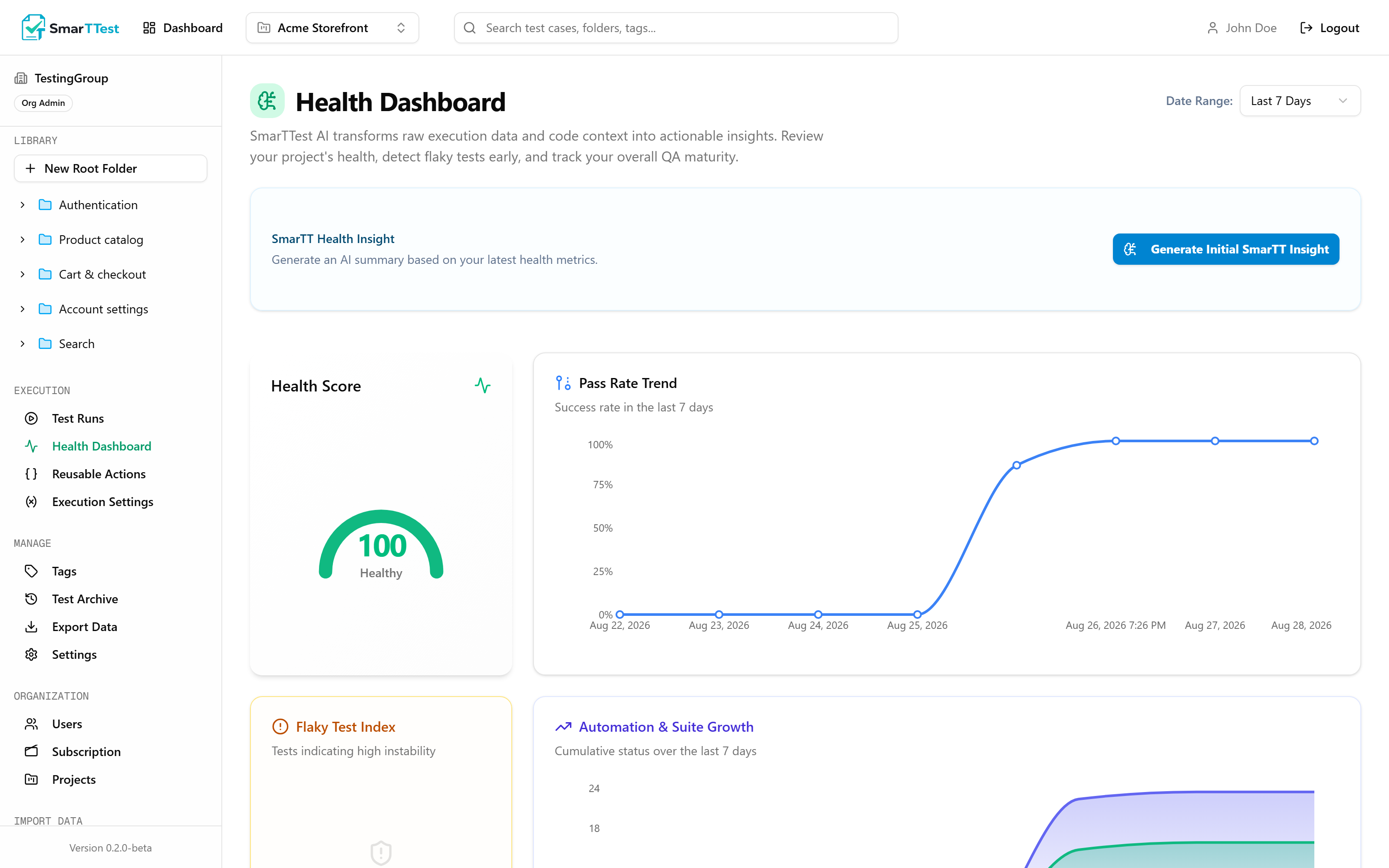
There is nothing to do on this screen. Watch the trend rather than the number, and spend the attention on coverage instead: the Automation & Suite Growth panel is the one worth reading here.
Warning: something is eroding
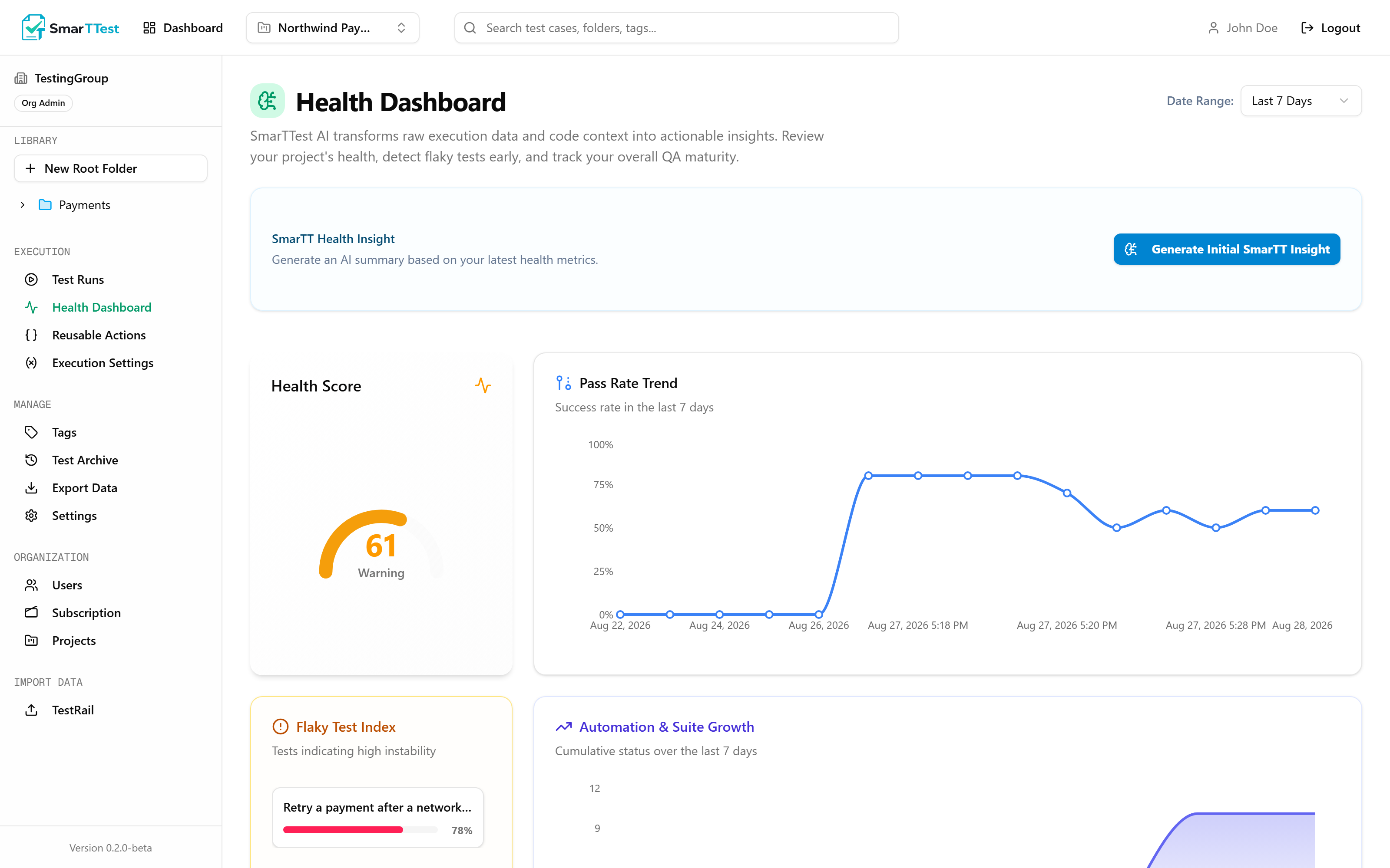
This is the band where the screen earns its keep, because the problem is still small enough to fix. The shape matters more than the score: a steady decline is usually the product getting worse, while a jagged line is usually the tests. Start with the Flaky Test Index, because an unreliable test also drags the pass rate down and hides whatever else is happening.
At Risk: the suite has stopped answering the question
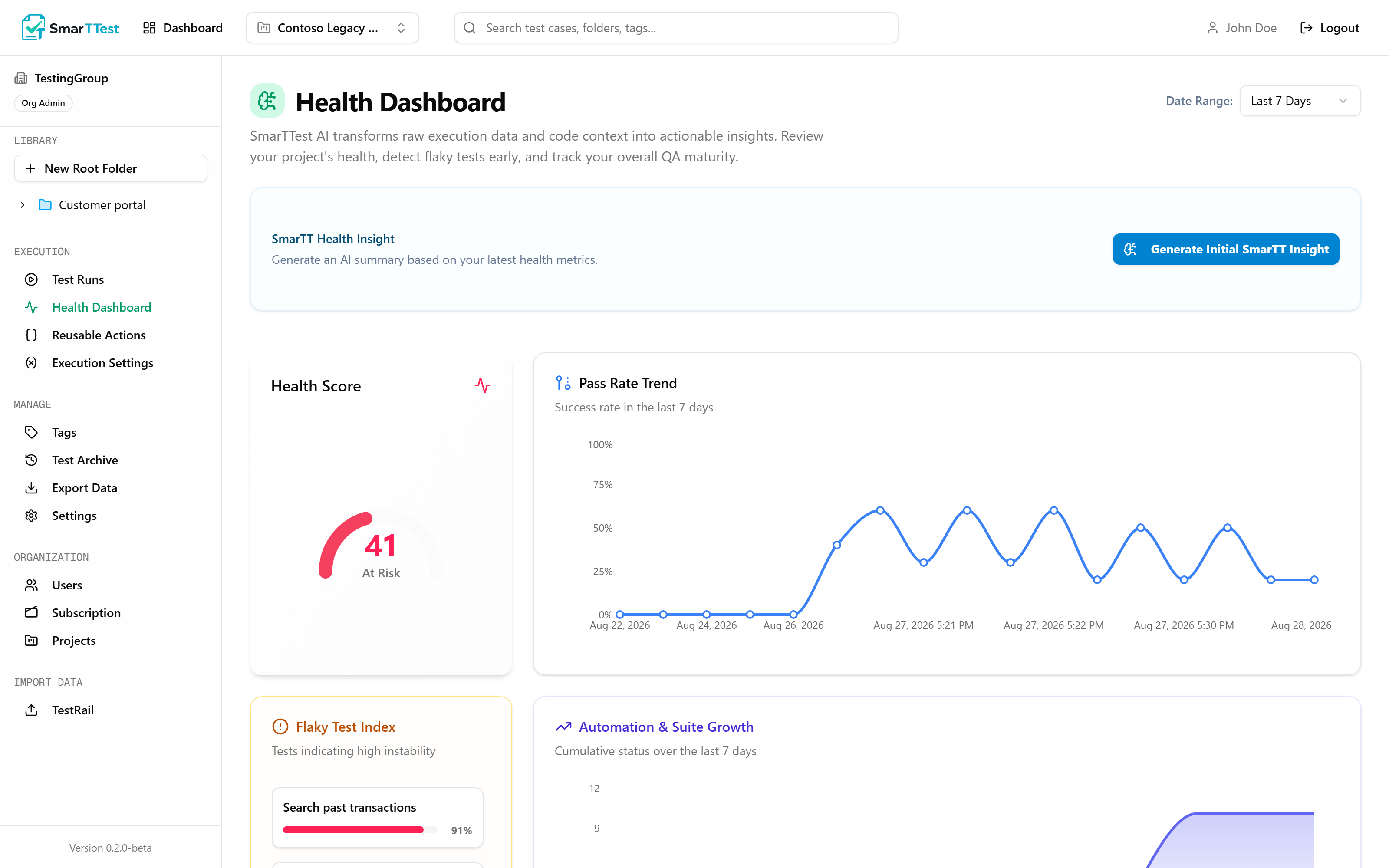
A suite in this state costs more than it returns: every run produces failures the team has learned to scroll past, so a real regression arrives looking exactly like the noise. Do not try to fix the score. Pick the worst offenders in the Flaky Test Index, and either repair them or archive them. A smaller suite you believe is worth more than a large one you ignore.
SmarTT Insight#
Alongside the numbers, the dashboard produces a written reading of them: what stands out, what is getting worse, and what is worth doing about it. It is meant to answer "so what?", the step between having metrics and acting on them.
Scope and range#
Everything shown is for the active project. Switching projects switches the dashboard. The time range filter changes which runs and results are counted.
Reading it well#
- Trends beat snapshots. A 78% pass rate means nothing on its own. A 78% that was 94% last month means quite a lot.
- Flaky tests first. They cost more than a low automation ratio, because they erode trust in every other result.
- Freshness reveals dead zones. An area that has not been executed in three months is untested regardless of how many tests it has.
- Automation ratio is a means, not an end. A high ratio built on tests with no assertions is worse than a low one. That is what the Quality Engine is for.